Unveiling Iconic Logos: Stories of the World's Most Famous Brands

“In the realm of communications, where ‘image is king,’ the logo stands out as the jewel in its crown,” as eloquently stated by Paul Rand.
Certainly, logos wield the potential to either elevate or diminish a brand’s identity. They serve as the embodiment of a company, playing a pivotal role in establishing it as a widely recognized brand. It’s remarkable how a singular piece of graphic design possesses the power to shape any business into a globally acknowledged product.
Jump To...
If we consider our surroundings, logos of various kinds and types encompass us. While some may go unnoticed, there are those instantly recognizable due to their impact and popularity. The key question here is what sets these two categories apart. What makes some logos easily identifiable?
The straightforward answer lies in the creation of the logo itself. The compelling narratives of a brand’s inception, coupled with the designer’s creativity and dedication to crafting a visual representation that encapsulates that essence, collectively result in a striking logo design.
Many renowned logos didn’t come into existence overnight; rather, they required extensive strategic thinking to create a lasting impact. They emerge from ambitious visions, captivating stories, and innovative minds. The amalgamation of these elements ultimately shapes a logo that captures attention due to its distinctiveness.
Therefore, each logo narrates a story. It could be the tale of the brand’s founder or the creative narrative of the designer’s endeavor to produce a one-of-a-kind graphic. When seeking inspiration for crafting the perfect logo, numerous considerations come into play. The brand’s fundamental values, consumer psychology, the intended message of the brand, and other such aspects significantly contribute to the narrative behind a brand’s logo.
Current Trends in Logo Design
Numerous prominent companies leverage current trends in logo design to create visually appealing and consumer-attractive logos. Some of the popular logo design trends include:
Color considerations
A particular color scheme plays a crucial role in enhancing the appeal of a brand logo to consumers, with blue and red emerging as the most prominent choices.
Based on data and observations, blue and red stand out as the most sought-after colors frequently employed by many brands in their logos. Approximately 35 percent of well-known logos feature a blue color, while 30 percent opt for red. These color choices reflect the widespread recognition and positive associations that these hues often evoke in consumer perception.
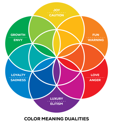
The chart illustrates the color preferences of several leading corporations across 26 industries. A notable trend is the predominant use of the color blue among these brands, highlighting its prominence and widespread adoption across various sectors.
Integrated Logos
A combination logo involves the fusion of two distinct types of logos to form a memorable and unified brand image. Remarkably, more than 60 percent of globally renowned logos employ combination marks, making it a highly popular and trendy choice among leading companies.

Combination logos offer the flexibility to blend various elements, such as a wordmark with a monogram, an abstract mark, or an image. Recognizable brands that utilize combination marks include Adidas, Microsoft, Target, and Burger King, showcasing the versatility and effectiveness of this logo design approach.
The most renowned typeface
The most fashionable logo style embraced by numerous renowned brands is Sans Serif. According to statistics, nearly three-quarters of the most well-known brand logos feature Sans Serif fonts and typefaces. Brands like Subway, Chanel, Toyota, Panasonic, among others, are exemplars of utilizing Sans Serif fonts in their logos. Helvetica, a widely used font, is also favored by many popular brands.
Creating an ideal logo involves weaving together various narratives and efforts. A brand aspires to craft a logo that etches itself into people’s memories, facilitating instant recall of products and services. While numerous globally popular logos exist today, achieving fame wasn’t instantaneous for many. Some brands persevered, evolving over time until their logos became the influential symbols they had envisioned.
The Stories Behind 39 Iconic Logos
Presented below are some exceptionally captivating, widely acknowledged, and renowned logos, each accompanied by its inspiring narrative and significance.
Amazon
Amazon stands out as a globally renowned tech company, but have you ever taken a close look at its logo design nuances? Initially introduced as “Cadabra,” the founder, Jeff Bezos, opted for a rebrand, giving birth to the name “Amazon.”
While the design of this widely recognized brand’s logo appears simplistic, it harbors a subtle yet meaningful symbolism. The small arrow positioned between the letters “a” and “z” subtly signifies that the brand offers a comprehensive range of products from A to Z. The gentle curve in the logo adds a touch of whimsy, resembling a smiling, dimpled cheek.
eBay
Functioning in more than 32 countries globally, your preferred e-commerce platform initially bore the name “AuctionWeb.” The brainchild behind this venture, Pierre Omidyar, also established a web consulting enterprise named “Echo Bay Technology Group.” It was from this venture that the inspiration for renaming his multimillion-dollar business emerged.
Since the name EchoBay.com was already claimed, he opted for the next best choice: eBay.com. The logo design for this brand was meticulously selected as a radiant and attention-grabbing symbol, showcasing the brand’s innovative spirit.
In any discourse about iconic company logos, the mention of the Google logo design is indispensable. Originally dubbed “BackRub” by founders Larry Page and Sergey Brin, the brand underwent a name change to “Google” after an employee misspelled the term “Googol.”
Ruth Kedar, the original designer, crafted the wordmark logo using the Baskerville Bold font. Over time, the logo underwent a redesign, adopting a sans-serif typeface for a more modern and appealing aesthetic. Reflecting the brand’s commitment to innovation, Google regularly transforms its logo on significant occasions, turning it into a dynamic Google Doodle.
Campsites of America
Now established as one of the most iconic brands in the U.S. and Canada, KOA (Kampgrounds of America) stands as the largest family camping provider globally. Founded in 1962, KOA boasts over 525 campgrounds across North America, and its official logo, designed by Karlo Fujiwara in 1961, has remained unchanged.
The logo ingeniously incorporates design elements: the straight lines form the letter K, the circle signifies O, and the triangular structure represents A. Beyond this, the vibrant yellow and red background evoke a sense of fun and relaxation for campers. A holistic view of the logo reveals a tent-like structure, seamlessly aligning with the services provided by KOA.
Olympics
The Olympics stands as the preeminent global sports competition, uniting athletes from diverse nations in a quest to bring honor to their countries. Its emblem features five interlinked rings of equal proportions, symbolizing the unity of the five continents through sports and the dynamism of the Olympic movement.
Each ring is uniquely colored, reflecting the hues found in the flags of the continents. The background is presented in white, symbolizing neutrality and peace. The choice of circles as the emblematic shape is deliberate, as circles evoke a sense of completeness and eternity, fostering a welcoming and amicable representation.
National Geographic Logo Design

Logo designs aim to etch a lasting impression of a cherished brand in the minds of customers or viewers. The National Geographic logo is meticulously crafted with this objective in mind. Designed by Chermayeff & Geismar, the logo is a reflection of the channel’s brand identity.
Originating as a magazine, National Geographic’s logo incorporates a yellow rectangular box, a nod to its print roots. Accompanying this, the two wordmarks prominently display the brand name in uppercase letters. The use of yellow in the logo symbolizes the sun, mirroring the channel’s expansive global presence that spans across the entire globe.
IBM Iconic Logo
IBM (International Business Machines Corporation) had its roots as the International Time Recording Company (ITR) established in 1888. Over the years, the brand underwent various logo iterations, incorporating different designs and names, until the introduction of its current logo.
Designed by Paul Rand, the iconic logo was unveiled in 1972. The present logo features “IBM” in bold block letters accompanied by stripes of equal width. These stripes symbolize the concept of equality among workers. Notably, the distinctive design was chosen intentionally, as no other company at the time employed a stripe-based concept, contributing to the unique and standout nature of the IBM logo.
MasterCard's Famous Logo
Prominent brands undergoing alterations in their name or logo tend to capture widespread attention. The Interbank Card Association (ICA) underwent transformations, transitioning to Master Charge and eventually adopting the name MasterCard in 1979, each change attracting public notice. Simultaneously, the brand’s logo underwent significant evolutions.
The MasterCard logo features two interlocking circles in red and yellow, representing modernization and optimization. Initially, the brand name was positioned beneath these circles. However, in 2019, a notable change occurred as the brand name was removed from the MasterCard logo, signifying a streamlined and contemporary design approach.
Louis Vuitton

Louis Vuitton Malletier, commonly known as Louis Vuitton, stands as a renowned luxury retail company. The creation of the company’s logo is credited to Georges Vuitton, the son of the legendary box-maker and founder. Georges devised the symbol by incorporating his father’s initials onto canvas. Upon closer inspection, the iconic LV logo also conveys the representation of a Japanese flower.
The choice of such a symbol was driven by the desire to deter counterfeiting of the logo. However, in contemporary times, the LV logo has become one of the most widely replicated symbols. The monogram features an italic uppercase letter “L” slightly tilted to the left, with the uppercase letter “V” designed to overlap the “L,” creating a distinctive and imitated design.
Formula 1

Formula 1, commonly referred to as F1, stands as one of the premier auto-racing sports events globally. Initially named Formula Internationale, the event underwent a reconsideration, leading to its rebranding as Formula 1. The visual identity of Formula 1 has undergone two significant changes over time.

In 1993, designer Carter Wong crafted one of the most iconic logos in F1 history. The design featured a tilted “F” and the numeral “1” adorned with speed marks. However, by 2018, the F1 logo underwent a redesign. The current iteration is presented in a vibrant red hue, with the letter “F” leaning forward, and “1” fashioned as a sleek diagonal line. The overall effect of the logo is a blend of simplicity, minimalism, and impactful design.
Financial Institution of America

Established by Amadeo Giannini in 1904 as “The Bank of Italy,” the financial institution underwent a transformation, adopting the name “Bank of America” by 1930. Today, it stands as one of the foremost financial institutions in the United States. Over the years, the logo design of this influential entity has undergone several significant changes.
In 2018, after multiple revisions, a more progressive and elegant logo was unveiled. The design incorporates the bank’s name alongside a pattern of blue and red stripes on the right, lending the entire logo a subtle resemblance to the United States national flag. The bank’s name is presented in a sans-serif font, contributing to the overall modern and sophisticated appearance.
Pepsi
The renowned beverage brand, Pepsi, isn’t just celebrated for its effervescent drink. Its logo design is equally iconic, as evidenced by its mistaken identity with the South Korean flag during the 2018 Olympics. Since 1903, Pepsi’s logo has undergone numerous transformations, culminating in the introduction of a distinctive design in 2014.
Pepsi invested a substantial amount, exceeding a million dollars, in crafting one of the most renowned logos of all time. The design integrates insights from various fields of knowledge, including Feng Shui, Earth’s magnetic field, and gravitation. Interestingly, when the logo is inverted, it forms the word “isded,” phonetically resembling “is dead.” This quirk has sparked the creation of numerous memes and YouTube videos, significantly boosting the brand’s popularity.
Apple
When discussing the most renowned logos globally, one cannot overlook the iconic symbol of the electronic giant, Apple. The design, characterized by its simplicity and minimalism, has captivated individuals worldwide. Ronald Wayne, the co-founder and original designer of the Apple logo, aimed to depict Isaac Newton sitting under an apple tree with his initial design.
In 1998, the logo underwent a redesign by Rob Janoff, featuring a bitten rainbow apple. The decision to depict a bitten apple aimed to prevent confusion with a cherry. Subsequently, the rainbow colors were transitioned into a more monochromatic style, providing greater flexibility in its presentation.
Dell
Dell stands as one of the foremost technology companies globally, serving approximately 180 countries with a workforce exceeding 150,000 employees. Originating under the name PC Limited, the company initially traded personal computers sourced from IBM.
In 2003, the company transitioned to the name Dell Inc and currently operates under the parent company moniker Dell Technologies. Its clean and captivating logo design stands as one of the world’s most recognizable. For 37 years, the Dell logo remained a simple wordmark. However, a subtle modification was introduced to the original concept in subsequent years.
The overall design takes the shape of a square, with a distinctive touch to the letter “E,” which is tilted, creating a microchip-like appearance. The tilted “E” signifies the unrestrained spirit inherent in the company, a spirit that has consistently propelled the entire PC industry forward.
Nike
With millions of active users, Twitter has evolved into the largest social networking site. The significance of its tiny blue bird logo, introduced in 2010, has become widely recognized.
Interestingly, the tiny blue bird has a name – “Larry T Bird,” inspired by the legendary basketball player Larry Bird. The moniker was bestowed by Twitter’s co-founder Biz Stone, a devoted fan of the player. The logo’s illustration was crafted by designer Martin Grasser, who utilized 15 circles stacked on top of each other to create the iconic symbol.
Merely glimpsing the renowned “swoosh” symbol is enough for instant recognition of “Nike.” The iconic Nike logo was crafted by Carolyn Davidson, a graphic design student at Portland State University, in 1971. She received a payment of $35 for creating what would become one of the most emblematic logos of the modern era.
However, there’s no need for sympathy; Phil Knight, the co-founder, later presented Davidson with 500 shares of Nike stock. In terms of symbolism, the logo represents the wing of Nike, the Greek goddess of victory. The simplicity of the design contributes to its widespread recognition as a symbol across the globe.
Coca-Cola
Coca-Cola, a soft drink brand established in 1886, boasts the world’s most iconic logo. The initial logo, created by Dr. John Pemberton, featured a simple machine-typed inscription.
Over time, Coca-Cola’s logo design has undergone significant evolution before settling into its current form. While the brand’s logo has remained fairly consistent, there have been a few modifications since 1941. Typography and the characteristics of the double ‘C’ in the logo design have seen changes since 1887.
The current logo design appears simplistic, yet it showcases a bolder font and straightened glyphs with vibrant cherry red wordmarks, emphasizing the brand’s enduring principles. The Coca-Cola logo seamlessly aligns with the timeless essence of the brand.
FedEx
FedEx, a prominent logistics company and courier provider, boasts a remarkable logo design featuring a distinctive purple-orange color combination. The acclaimed logo incorporates a clever design element.
Upon closer inspection, one can discern a strategically concealed forward arrow positioned cleverly between the letters E and X. This arrow symbolizes the company’s continuous forward movement, highlighting its commitment to delivering services with precision, speed, and perseverance.
The unconventional combination of purple and orange colors conveys qualities of prestige, drive, and success in the services provided. The artfully placed arrow, coupled with the purple-orange color scheme, contributes to making the FedEx logo truly iconic.
The present-day logo design manages to convey a wealth of meaning without overwhelming complexity and signifies the company’s diversification of services.
Rolex
Luxury brands often have well-documented histories, but Rolex’s case is somewhat mysterious. The name itself has an unknown origin, and its true roots remain elusive. Regarding the logo design, it was initially trademarked by Wilsdorf and Davis in 1925.
The original Rolex logo featured a five-pointed crown in gold positioned above the word “Rolex” written in green. This design underwent two changes. In 1965, the crown’s color shifted from gold to bronze, and the text became pewter blue. By 2002, the original color scheme was reinstated.
Instagram, one of Silicon Valley’s most successful startups, has been engaged in redefining its logo since its inception. The name “Instagram” is a blend of “instant” and “telegram.” Kevin Systrom, the co-founder of the platform, designed its initial logo in 2010.
The first logo featured a polaroid camera with a rainbow stripe, effectively reflecting Instagram’s core service of photo sharing. In 2016, the Instagram logo underwent a complete redesign. The rainbow stripes were removed, giving the logo a more modern and refreshing appearance.
Starbucks

Paired with fresh and wholesome choices, Subway stands out as one of the most prominent fast-food chain establishments in the United States. Throughout the years, its logo has undergone several redesigns. Initially, the Subway logo featured two arrows extending from the S and Y in the word Subway. Despite a few alterations, the logo retained its impactful overall appearance.
For a brief period, Subway utilized a single color in its logo. However, with the new design, the logo now incorporates vibrant green and yellow hues. This color combination conveys two key messages to consumers: positivity and flavor. The inclusion of two arrows communicates the concept of speed, promoting a sense of movement and motion.
Subway has also crafted a monogram from the logo, actively incorporating it into its marketing strategies.
Starbucks
Ever pondered about the inspiration behind Starbucks incorporating the image of a mermaid in its logo? The founders opted for the brand name of the most sensible character in Moby Dick, Starbucks. In a quest for a mythical creature that could aptly represent the brand, they delved into various marine books.
The chosen emblematic figure was the Siren, selected to craft a more intricate brand persona. During a rebranding by Lippincott, the Siren was given a more human-like appearance, coupled with a green and white color scheme. The Starbucks logo’s cultural reference adheres to contemporary design standards, solidifying its status as one of the most memorable logos among the audience.
Walmart

The renowned Walmart logo stands as one of the most unforgettable symbols in branding history. Originally designed in 1962, the initial logo was straightforward and centered on the brand.
However, with multiple iterations over the years, Walmart experimented with various designs before settling on the current one in 2008. Presently, the Walmart logo showcases lowercase letters for Wal and Mart, with no gap between them.
The font color in the logo has shifted to a lighter shade, accompanied by a new sparkle at the end reminiscent of a sunshine symbol. This added element in the logo represents the core principles of the company.
World Wildlife Fund
The renowned energy drink, Red Bull, originated from the entrepreneurial vision of Dietrich Mateschitz, an Austrian, in 1987. The brand’s logo features two red bulls engaging in a clash of horns against a gold backdrop with the inscription “Red Bull.”
Ever pondered the significance of the two bulls on the Red Bull can? The depiction of two red bulls, with their horns interlocked, set against a vibrant yellow sun, symbolizes energy, speed, and power. The logo’s bold and rounded lettering contributes to capturing the audience’s attention instantly.
Red Bull
The World Wildlife Fund, commonly known as WWF, is an organization dedicated to assisting local communities in conservation efforts for natural resources. In the early days of the institution, a giant panda named Chi-Chi found a home at the London Zoo. Recognizing the need for a symbol that transcends language barriers and imparts a powerful image to the brand, the founders opted for the panda.
Originally designed in 1961 by Sir Peter Scott, a painter, naturalist, and founder of WWF, the logo underwent multiple redraws until its final version was established in 2000.
Royal Bank Of Canada
Boasting a history spanning 155 years, the Royal Bank of Canada (RBC) was originally established as the Merchants Bank of Halifax in 1864 in Nova Scotia. With approximately 15 million clients worldwide, RBC underwent a significant transformation from its initial black and white logo to a more contemporary design.
The bold uppercase “RBC” in the logo draws inspiration from the primary badge of the Royal Bank of Canada. The font utilized is a modern sans-serif typeface, characterized by thick and refined lines, contributing to the logo’s distinctive appearance. In terms of color, the RBC logo incorporates blue and yellow hues, with “RBC” written in white. This overall design imparts a professional, confident, and energetic aesthetic to the logo.
Microsoft
Founded in 1975 by Bill Gates and Paul Allen, Microsoft began as a small garage project, evolving into the world’s largest tech company. The initial logo design was crafted by its founders and featured an original sans-serif font with concentric lines, capturing a 70s-inspired aesthetic.
Following multiple redesigns, a new and contemporary logo emerged in 2012. The modern, minimalistic design incorporated the Segoe UI font, and the addition of four colorful boxes on the left distinguished it from its predecessors.
Beyond the logo, Microsoft’s exponential growth is evident. The brand has introduced numerous upgraded versions with enhanced features, now seamlessly compatible with various VPS servers.
Playboy
Designed by Art Paul for the second issue of Playboy magazine, the iconic tuxedoed bunny logo stands out as one of the best in the history of logo design. Conceived in under 10 minutes, the original bunny sketch received admiration from the infamous brand’s founder, Hugh Hefner.
Since its creation, the logo has remained unchanged and continues to grace the magazine. Occasionally appearing prominently or cleverly concealed within the publication, the black color of the logo signifies simplicity, success, and sophistication. The font used for “PLAYBOY” features serif typography with bold and capital letters.
McDonald's
It is instantly recognizable when you see two golden arches forming a large “M” figure – it’s none other than McDonald’s. As the world’s largest food-chain company with around 35,000 restaurants in approximately 120 countries and a net worth of $39.1 billion, McDonald’s stands as the ninth wealthiest company.
The first logo design for this renowned brand emerged in 1940. Evolving with the times, the business aimed for a simpler logo to captivate customers and enhance brand recognition. In 2003, the brand embraced the iconic golden arches for its logo.
This symbol seamlessly integrates with the brand, and there have been no significant changes to it. Interestingly, not many people are aware that the arches cleverly resemble golden brown French fries bent to form an “M,” subtly advertising one of the popular dishes on the menu.
Moreover, McDonald’s digital presence has further popularized the brand. Leveraging an authentic VPS server, it ensures a lightning-fast website and user interface, facilitating easy online access to its services for consumers.
PIXAR
The iconic jumping lamp that precedes Pixar movies is instantly recognizable. However, it wasn’t always the case. Initially known as The Graphics Group, Pixar had a logo featuring the studio’s name in a sans-serif font with red, black, and white colors.
In 1986, Steve Jobs assumed control of the company, renaming it Pixar and unveiling a new logo design in 1994. An employee, Pete Docter, played a pivotal role in this transformation, introducing a serif font style.
The most captivating element of the Pixar logo, Luxo Jr., the jumping lamp, made its debut around 1995. The “I” in Pixar was transformed into a lamp, serving as both the company’s mascot and the namesake of Pixar’s inaugural animated movie, “Luxo Jr.”
Versace
Versace stands out as a leading haute couture brand worldwide, exuding a royal ambiance reflected in its iconic logo. The initial Versace logo emerged two years post the brand’s launch, featuring the designer’s names arranged closely in a sans-serif font.
A subsequent logo design aimed to infuse freshness and modernity into the brand’s image. Notably, this design incorporates the emblematic head of the Medusa, a famous figure from Greek mythology. Gianni Maria Versace, the brand’s founder, encountered this mythological creature during his childhood in Reggio Calabria, leaving a lasting impression.
Medusa, associated with war and wisdom, possessed a gaze that could turn individuals into stone. Gianni drew inspiration from this myth to symbolize the juxtaposition of beauty and destruction. The logo’s gold, black, and white color palette conveys power, style, and elegance.
Baskin Robbins
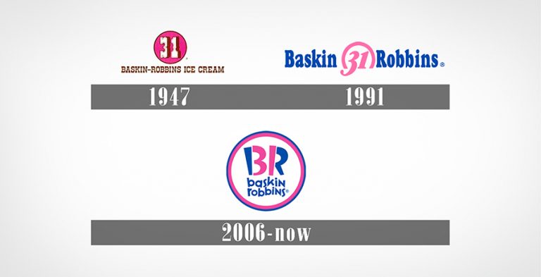
The renowned ice cream brand Baskin-Robbins has a captivating origin story, accompanied by a hidden meaning in its logo. In 1945, Irvine Robbins initiated his ice cream shop in Glendale, California, while his brother-in-law, Burt Baskin, simultaneously opened an ice cream store in Pasadena. The two eventually joined forces to establish the brand “Baskin-Robbins.”
The distinctive aspect of Baskin-Robbins was its offering of 31 flavors of ice cream, a remarkable feat at the time. The brand sought to highlight this variety in its logo design by incorporating the number “31” into it.
The initial Baskin-Robbins logo featured the number “31” positioned at the top of the brand name. As time progressed, they integrated the number “31” into the brand’s name within their pink and blue logo. In a recent update in 2022, Baskin-Robbins underwent a logo makeover, opting to replace the blue color with brown while retaining the incorporation of the number “31” in the design.
Samsung

The highly successful tech giant Samsung had humble beginnings that might surprise many. Originally, the brand started as a supplier of rice, noodles, and dried fish to neighboring countries, specifically Manchuria and China. By approximately 1939, they expanded their product line to include wine. As the world entered the 20th century, Samsung gradually transitioned into the electronics industry.
Alongside this evolution, the Samsung logo underwent several changes. In its initial phases, the logo featured three stripes, stars, and wheat plants. The symbolism behind these elements was tied to the brand’s name, with ‘sam’ representing “three” and ‘sung’ standing for “stars.” As Samsung continued to shift its focus and diversify its offerings, the logo design evolved accordingly.

In its present status as a globally renowned electronics brand, Samsung’s logo design has undergone significant evolution. For certain products, a blue ellipse is employed, featuring the word “Samsung” written boldly in white sans-serif letters. Additionally, some products utilize a logo without the ellipse, showcasing the brand’s versatility in its visual identity.
Porsche
Porsche, a brand synonymous with class and luxury, exudes its identity and splendor through its distinctive logo. The logo can be deconstructed into four parts: two diagonal sections with three antlers each and the other two diagonals featuring black and red stripes, all converging at the center where the Porsche horse is elegantly placed.
The iconic Porsche wordmark, presented in a sans-serif, all-capital font, is positioned at the top. Above the Porsche horse, the word “Stuttgart” is inscribed, adorned with black and golden outlines. Every element within the Porsche logo design reflects the brand’s values and contributes to its regal appearance. The various iterations over the years have consistently aimed to showcase the timeless beauty of the Porsche brand.
Nestle

Nestle, a multinational Swiss brand, has experienced significant evolution over the years, expanding beyond confectionary to offer a diverse range of products from coffee and cereals to baby food and dairy items. Alongside the brand’s evolution, Nestle’s logo has also undergone substantial transformations.
Derived from the name of the company’s founder, Henri Nestle, the word “Nestle” translates to “The Nest” in German, inspiring the creation of its logo. Throughout the brand’s history, the logo has seen various changes, yet one constant feature has been the depiction of birds and a nest. The font used in the logo, featuring the company name, has consistently been in sans-serif typography, designed by Max Miedinger and Eduard Hoffmann.
Mercedez-Benz
The logo of Mercedes-Benz, featuring a three-pointed star, stands as a symbol of class, elegance, and sophistication. The origin of this iconic logo can be traced back to a postcard sent by Gottlieb Daimler to his wife. Gottlieb Daimler was one of the founders of DMG (Daimler Motoren-Gesellschaft), a company that eventually owned Mercedes.
The postcard was adorned with a three-pointed star, and as the brand gained success, his sons, Adolf and Paul Daimler, proposed adopting the star as the official logo for the automobile brand. While the logo design has undergone various changes over time, the three-pointed star has remained a central and enduring element.
Adidas
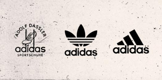
Adidas, now the world’s largest sports apparel manufacturer, started as a small family business founded by the Dassler brothers, Adolf and Rudolf. In its early years, the brand featured the Dassler name on its logo design.
Following some rebranding efforts, Adidas began incorporating its name, and since 1967, the brand has introduced various logo designs, including the trefoil, the mountain logo, Adidas NEO, and the plain wordmark logo. Adidas has largely retained these designs and used them for different product lines.
Notably, the consistent element across all Adidas logo designs is the presence of the three stripes. Initially introduced for the construction and distinctive identity of Adidas shoes, Adolf Dassler initially faced restrictions from his family in using the trademark. To overcome this, he added a third stripe. As the three-stripe design was already utilized by a Finnish sports brand called Karhu, Adolf purchased and trademarked the rights to it.
Walt Disney
The Walt Disney Pictures logo, featuring the iconic Cinderella castle and Walt Disney’s signature, was introduced in 1995, bringing a dreamy and magical touch to the company’s visual identity. This logo has become one of the most recognizable symbols, characterized by its enchanting calligraphy.
It is believed that the emblem was hand-drawn by an employee of the Walt Disney Company. In recent times, the logo has undergone some iterations, with most of the text being removed, leaving only the word “Disney” in the design. The simplified Disney logo continues to captivate audiences, contributing to the company’s global recognition.
Quicksilver's Female Clothing Line
Established in 1969, Quiksilver is an Australian clothing brand specializing in accessories and shoes for extreme sports such as skateboarding and snowboarding. The founder, Alan Green, designed the logo for the brand, and since its inception, it has remained unchanged.
The logo draws inspiration from Japan’s Mt. Fuji, incorporating a design that aligns with the company’s mission and vision. The image of the snow-capped Mt. Fuji, combined with a typhoon wave, provides a visually appealing background that resonates well with the brand’s focus on surfing-related products.
Logos go beyond being mere artwork; they serve as powerful tools for building a strong brand identity and capturing the attention of potential customers. A well-designed logo can contribute to a business outperforming its competition and fostering a loyal consumer base.
In this article, we have highlighted some of the world’s iconic brand logos, providing a brief glimpse into their compelling backstories. These logos share common elements, but their uniqueness and visual appeal stem from the clever use of colors and negative space. Through these innovative designs, businesses have succeeded in establishing a strong and memorable presence.
Indeed, a logo transcends being a simple graphic; it serves as a powerful tool for defining a brand’s distinctiveness and cultivating its unique identity among consumers.
Frequently Asked Questions
Bass Brewery holds the distinction of being the first company to trademark a corporate logo in 1876. The logo featured a red triangle with the word “Bass” elegantly scripted in cursive writing. Interestingly, this early logo design bore a resemblance to the iconic Coca-Cola logo.
Status symbols and brands with a substantial customer base often become targets for logo counterfeiting. Notably, logos from esteemed brands such as Gucci, Versace, and Supreme are particularly renowned for being frequently replicated or counterfeited.
A secondary logo serves as a variation of the primary or main logo design. Typically, it is a simplified or stacked version of the primary logo, placing a stronger emphasis on the brand name. The shape of the secondary logo can be either vertical or horizontal, and it is designed based on the characteristics and nature of the business.
Which is the most ancient brand emblem that has endured without any modifications?
Crafting a logo design involves adhering to fundamental principles that go beyond skill and talent. Here are seven essential principles for creating a comprehensive logo design:
Simplicity
Memorability
Originality
Modern Yet Timeless
Balance
Complementary
Versatility
Indeed, various logo design types exist to facilitate the creation of a logo. However, brands commonly opt for these five types to develop an outstanding logo design:
Word Mark
Combination Mark
Emblem
Letter Mark
Symbol or Icon


