Revolutionizing Online Excellence: Top Business Websites of 2023 for Unrivaled Success

In the realm of entrepreneurship, a strong online presence is essential for small businesses aiming to make a lasting impact. Amid unprecedented changes in industries, successful enterprises innovate and stay ahead.
As 2023 concludes, the importance of a well-designed website cannot be overstated. This article delves into top small business website templates and examples, serving as inspiration for entrepreneurs and small business owners navigating the digital landscape.
Jump To...
Top 20 Small Business Website Examples in 2023
Presenting a compilation of the top 20 small business websites in 2023.
1. Home Designer – Truoba
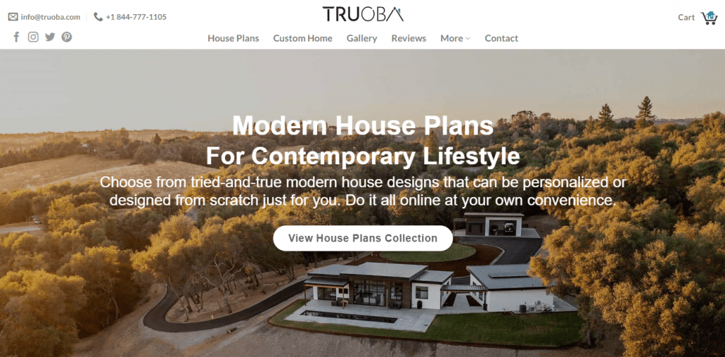
Truoba serves as the ultimate destination for contemporary home design, and its website embodies simplicity. User-friendly and visually pleasing, it functions as a digital showroom, seamlessly integrating the latest styles with a touch of timeless charm. Whether your preference is single-family homes or multi-unit setups, the site offers plans catering to every taste.
Key Features
1. Truoba adeptly conveys its mission through captivating visuals, offering a glimpse into the personalities behind the brand.
2. For assistance or inquiries, live chat support guarantees real-time help and guidance.
3. Truoba’s homepage incorporates trust-building elements, including principles and persuasive ad copy.
4. The website exudes a unique rustic tone, embodying Truoba’s commitment to a harmonious blend of modern and classic design.
5. Engage with floor plans on the Truoba website to gain a tactile understanding of your envisioned dream house.
2. Photographer – Simone Dicosta
Simone Dacosta’s photography website serves as a visual delight for art enthusiasts and individuals seeking a glimpse into life’s vibrant moments. Renowned photographer Simone Dicosta presents a captivating portfolio on the website. Navigating the site is effortless, providing users with the opportunity to delve into Simone’s varied portfolio and past projects. The straightforward design ensures that the spotlight remains on the compelling visuals, where each image narrates a distinct story.

Functioning as a digital gallery, the website showcases the breathtaking visual impact of Simone’s work. It strategically utilizes negative space to highlight each picture, allowing the images to speak for themselves. The user-friendly navigation guides visitors through an extensive portfolio, customer testimonials, and comprehensive photo packages.
Simone Dicosta’s website stands as a stellar illustration of how a photography website or small business website builder platform should prioritize showcasing captivating images and providing users with a smooth browsing experience.
Key Features
1. The website showcases a collection of striking images, accentuating Simone’s talent in capturing the nuances of interior and architectural design.
2. The photographs are generously spaced on the website, presenting the work with a minimalist arrangement.
3. Utilizing a free domain name plan and providing clear contact information, Simone’s website fosters seamless communication between her and potential clients.
4. Infused with informal language, the website offers insights into the photographer’s life, establishing a deeper connection with visitors.
5. Prioritizing a superior user experience, the website is responsive and functions seamlessly on all devices, including smartphones and tablets.
3. Artist – Ine Agresta
Ine Agresta’s website presents a dynamic and enchanting art space that reflects her Uruguayan heritage while residing in Denmark. Her artwork, characterized by vibrant, expressive visuals, vividly captures the shared human experience, unraveling its universality through personal narrative exploration.

Envision the website as a voyage through captivating images, leading you through various thoughts and emotions. It forges connections between everyday elements and fantasy, prompting contemplation about one’s identity. Delving into Ine’s distinctive world and narratives becomes the primary allure of the website.
The images on the website are truly captivating, and the page layout is deliberately straightforward. This design choice aims to facilitate effortless and enjoyable exploration for art enthusiasts.
Key Features
1. The website features an online store and portfolio, showcasing a carefully curated selection of Ine’s finest artworks. This provides visitors with an opportunity to explore and potentially acquire pieces.
2. The website keeps visitors informed about upcoming exhibitions or shows, encouraging them to return and maintain interest in the artist’s work.
3. Utilizing high-quality images and videos, the website presents Ine’s artwork in a visually rich portfolio, aiming to attract and engage visitors.
4. Infused with a personal touch throughout, Ine’s website invites visitors to delve into her world and establish a connection with her art.
5. With a clean and simple layout, the website design ensures that the primary focus remains on the artwork, facilitating easy navigation for visitors.
4. Brewery – Sureshot Brewing
Explore the quintessence of a finely crafted brewery website at the online abode of Sureshot Brewing. With a chic and minimalist design, the website is dedicated to keeping the spotlight on the true star of the show—their exceptional products.
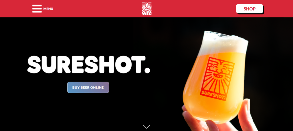
Sureshot Brewing’s website places a premium on user experience, seamlessly blending a modern layout with straightforward navigation. This design allows enthusiasts to effortlessly explore their distinctive offerings and perhaps discover a new favorite drink.
Infused with a personal touch, the “About” section on the website offers insight into the brewery’s background, mission, and introduces the vibrant team steering the brand. Sureshot Brewing’s website excels in both simplicity and functionality, ensuring a smooth and engaging experience for beer lovers.
Key Features
1. The website dedicates ample space to showcase products with a clear and simple appearance.
2. Comprehensive descriptions accompany each product, offering customers crucial details on the taste, composition, and brewing method of the beer.
3. Seamless integration with the online store enables customers to make direct purchases through the website.
4. Contact details for the brewery are easily accessible on the website, facilitating inquiries or discussions.
5. Strategic calls to action prompt users to explore products, learn more about the brewery, and make a purchase, enhancing user engagement.
5. Musical Instrument Store – Music Villa
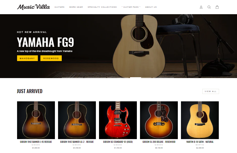
Explore Music Villa’s online platform, a comprehensive hub catering to musical instrument enthusiasts. Tailored for musicians of all skill levels, the site presents a diverse range of instruments, equipment, and accessories.
Key features
1. The website offers fascinating insights into the history and intriguing stories behind musical instruments.
2. Music Villa features a unique collection of exceptional acoustic and electric guitars, including rare and vintage pieces.
3. The physical store hosts complimentary events such as live music, lessons, and songwriting sessions, fostering engagement within the music community.
4. Flexible payment options are available on the website, including installment plans for customers in Germany or the UK.
5. Music Villa ensures a seamless shopping experience for clients with major payment options and prompt, efficient delivery services.
6. Catering Service – Finer Palate
Embark on a culinary journey with Finer Palate, a standout among the 20 Best Small Business Website Examples in 2023. Exploring Finer Palate is akin to receiving an exclusive invitation to exceptional dining. The catering service’s website boasts an array of truly delightful food options that are sure to delight your taste buds.
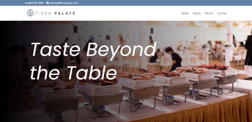
The website is user-friendly and visually appealing, presenting a comprehensive display of food choices and personalized options for events. Finer Palate stands as a testament to the perfect blend of sophistication and accessibility in the realm of website builders for small businesses.
Key Features
1. Galleries showcasing previous occasions and food arrangements highlight the business’s skills and aesthetics.
2. Finer Palate offers free business updates and informative content, attracting clients and showcasing their expertise.
3. Customer testimonials are prominently featured on the website, establishing credibility and trust with potential clients.
4. The website is accessible to users of all sizes on a variety of mobile devices due to its responsive design.
5. Prioritizing high-quality images, the website highlights culinary options and provides users with an immersive experience.
7. Fetish Furniture Store – BDSM Architecture
The distinctive yet tastefully curated website of BDSM Architecture welcomes visitors into a realm where furniture meets fetish. This unique furniture store offers a range that seamlessly blends style and function, catering to specific interests.
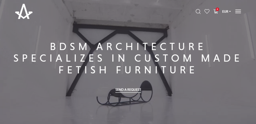
The sleek design of the popular website builder provides comprehensive product descriptions and a user-friendly purchasing experience, enticing customers to explore and purchase a variety of products.
BDSM Architecture stands out in the evolving landscape of digital entrepreneurship. It not only redefines small business website builders and online platforms but also discreetly and sophisticatedly caters to a niche community.
Key Features
1. The website captures people’s interest in its unique furniture by presenting it in a cool and visually striking manner.
2. Catering to the specific niche of the furniture industry, the website embodies a unique and distinctive company identity.
3. The website provides detailed information about the materials used, the manufacturing process, and the design concepts behind their special furniture for curious and interested customers.
4. Integrated with social media networks, the website fosters interaction with the audience and promotes their products.
5. Customers can confidently shop on the website, thanks to its straightforward and secure checkout procedure.
8. Podcast – Unladylike
Unladylike, a podcast platform, showcases a compelling website featuring a clean and modern design. The site adeptly addresses sensitive topics, offering accessible discussions on workplace challenges and personal growth.

The user-friendly website hosts numerous episodes, serving as a valuable resource for those who enjoy learning new things. Unladylike goes beyond mere discussion; it feels like a friend talking about relatable topics in an understandable manner.
For those seeking real-life insights presented in a humorous and easily digestible format, this podcast website is the ideal destination.
Key Features
1. Unladylike effectively showcases its podcast episodes, providing ample information and intriguing content for its listeners.
2. Clear and intuitive navigation allows visitors to easily access information and explore various podcast episodes.
3. The website offers interesting and educational content tailored to match the interests of its audience.
4. Providing a free version of podcast updates, the website encourages community involvement through seamless integration with social media platforms.
5. Joining, contributing, and engaging in conversations with the podcast creators is effortless, fostering a sense of community among the audience.
9. Restaurant – Bar Kismet
Embark on a straightforward and delightful culinary experience at Bar Kismet. The website is user-friendly, offering a menu featuring delectable dishes crafted from local ingredients.
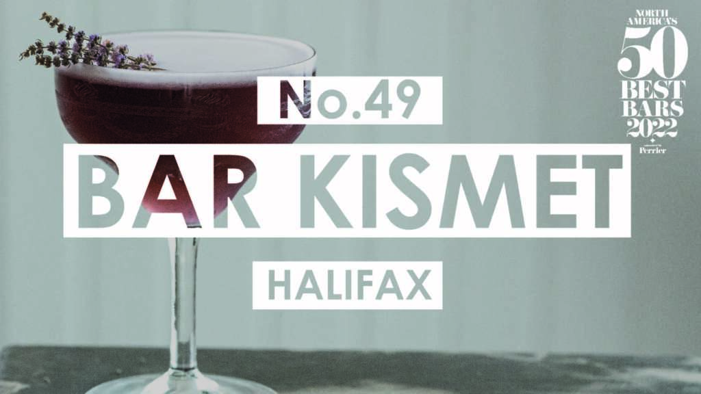
Bar Kismet’s online platform, featuring a clean design, offers crucial details about the restaurant’s ambiance, operating hours, and special offerings. The simplicity portrayed on the website reflects the restaurant’s preference for keeping things uncomplicated. It serves as a welcoming digital gateway, inviting visitors to explore the charm and delectable offerings of Bar Kismet, a local culinary gem.
Key Features
1. Bar Kismet effectively showcases its food, providing ample information and engaging content for visitors.
2. The restaurant shares enticing deals, special offers, and upcoming events to capture the interest and involvement of people.
3. Customer endorsements and evaluations are prominently featured on the website, establishing credibility and trust with potential customers.
4. Through its layout and visuals, the website adeptly conveys the vibe of the restaurant and the overall dining experience.
5. The website facilitates customer reservations through an easy and convenient reservation system directly accessible on the platform.
10. Home Goods Shop – Little Karma Co.
Step into The Little Karma Co.’s world through its intuitive design, where you’ll discover a thoughtfully curated selection of home goods seamlessly blending style with practicality. The website presents a collection of charming items for your home, including special candles that add a cozy and stylish touch.
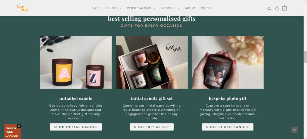
With a tidy appearance, the website facilitates easy exploration of each product through detailed descriptions and appealing pictures. Little Karma Co. goes the extra mile by providing a seamless checkout experience, ensuring a stress-free shopping journey for customers.
Key Features
1. Little Karma Co. establishes trust by featuring customer reviews and testimonials, creating a reliable space for buyers.
2. The website prioritizes a secure and straightforward purchase experience, instilling confidence and assurance for online shoppers.
3. Little Karma Co. captivates its audience by skillfully presenting its diverse range of home goods. The website provides detailed insights and engaging content.
4. Visitors can effortlessly connect with Little Karma Co. for inquiries or purchases, thanks to readily available contact information.
5. The simple website design facilitates easy exploration of various products, ensuring that users can find information without any hassle.
11. Coffee Brand – Progeny Coffee
Progeny Coffee has gained popularity among small businesses for its online store offering delicious coffee beans. With a passionate commitment to supporting coffee farmers, their mission is to ensure these farmers lead fulfilling lives free from poverty. This is achieved through the sale of exceptionally high-quality coffee.
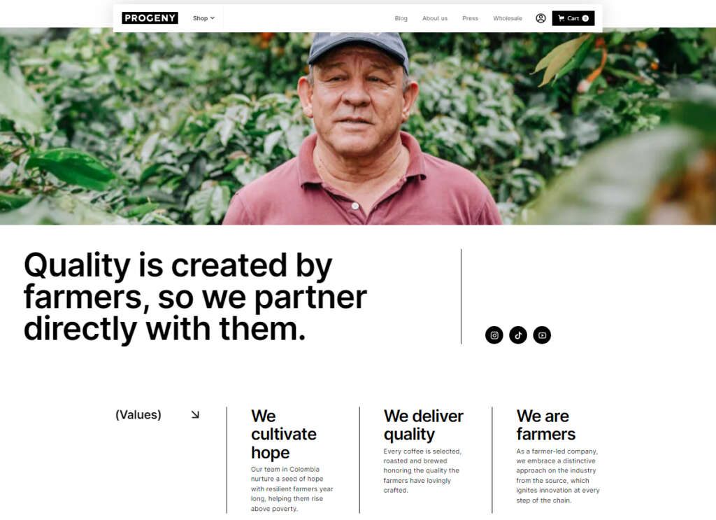
Indeed, when you choose to purchase Progeny Coffee, you’re not just treating yourself to a flavorful cup, but you’re also actively participating in the betterment of farmers’ lives. It’s a unique opportunity to make a positive impact while savoring your coffee. Progeny Coffee, with its emphasis on single-serve options, whole-bean coffees, and brewing gear, is dedicated to a significant mission.
Key Features
1. The website exudes a warm color tone and features a user-friendly design seamlessly integrating a rustic theme, showcasing the brand’s commitment to quality.
2. The product catalog is easily navigable, ensuring a straightforward purchasing experience for customers.
3. Attractive visuals featuring heroic men effectively convey the mission of the brand, providing customers with a clear understanding.
4. The checkout process is streamlined, ensuring an easy and efficient transaction for customers.
12. Subscription Service – Seamwork
Seamwork emerges as a professional website dedicated to empowering sewing enthusiasts. It offers a subscription service encompassing monthly sew-along classes, sewing patterns, and a vibrant community comprising over 20,000 sewists.
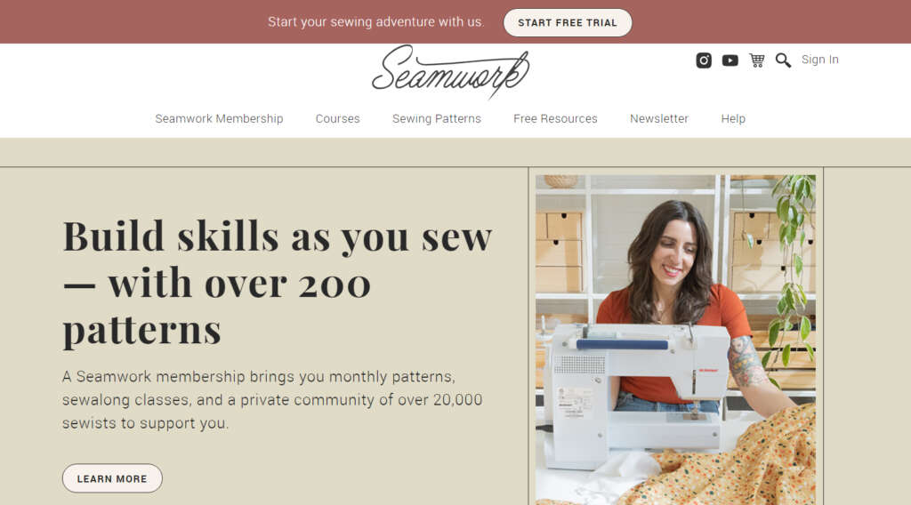
The website seamlessly blends simplicity and functionality, crafting a visually appealing and engaging platform for users who are passionate about contemporary fashion and subscription services.
Beyond its offerings, Seamwork cultivates a collaborative space where members can share insights, exchange ideas, and celebrate their sewing projects. This community aspect adds a valuable dimension to the platform, enhancing the overall experience for sewing enthusiasts.
Key Features
1. Seamwork’s website features a calming color palette, utilizing pastel hues to establish a tranquil atmosphere.
2. The user-friendly interface seamlessly navigates through its contemporary and chic theme, reflecting modernity and elegance in alignment with the brand’s fashion-forward approach.
3. Alongside its aesthetic appeal, the website offers a well-designed layout that enhances the overall user experience.
4. The free website builder extends beyond a quiz section, providing interactive and personalized experiences for users.
13. Beauty and Skincare Brand – SOLIDU
The SOLIDU online store is a visual delight, featuring content that reads as if it were human-written. Its design is uncluttered and refined, mirroring the purity of its skincare products. Originating from Lithuania, SOLIDU sells a range of solid beauty products online, encompassing shampoos, conditioners, soap, and body butter.
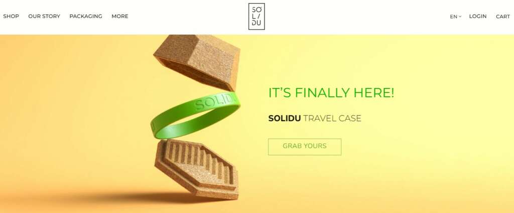
The SOLIDU e-commerce website reflects a profound commitment to the environment by placing a strong emphasis on eco-friendliness. It stands out for using low-waste products and incorporating compostable packaging, showcasing a deep love for sustainability in their business practices.
Indeed, this commitment to eco-friendliness is not limited to SOLIDU’s product range but is deeply ingrained in their ethos. This makes SOLIDU a conscious choice for individuals seeking beauty products that align with sustainable and environmentally friendly practices. The brand’s dedication to a green and ethical approach resonates with environmentally conscious consumers.
Key Features
1. SOLIDU’s e-commerce website features a visually pleasing design with a soft pastel and white color scheme.
2. The minimalist interface places a profound focus on product details, with the primary goal of highlighting the brand’s eco-friendly theme and dedication to sustainability.
3. Crucial features, such as a skin type quiz, informative blogs, and a refill program, underscore SOLIDU’s commitment to customer satisfaction and environmental responsibility.
4. The innovative element on the shop page allows for dynamic changes in the product’s photo when the cursor hovers over it, enhancing the overall user experience.
14. Cleaning Service – Cleanadora
Cleanadora is a dedicated house and commercial property cleaning service with a mission to free families and businesses from the burdensome tasks of cleaning. Their focus is on providing efficient and effective cleaning solutions to enhance the living and working environments of their clients.
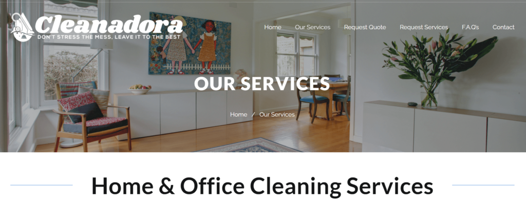
Cleanadora’s insured and bonded cleaning crew is equipped with high-quality tools, including hospital-grade disinfectants and HEPA filtration systems, ensuring a meticulous and effective cleaning process. This commitment to using top-notch equipment reflects their dedication to providing a thorough and professional cleaning service.
By prioritizing excellence, Cleanadora offers a dependable solution for sustaining a clean and healthy environment. This not only alleviates clients’ stress from tedious chores but also enables them to redirect their focus towards their priorities. Cleanadora’s commitment to providing a reliable and high-quality cleaning service contributes to the overall well-being and productivity of their clients.
Key Features
1. Cleanadora’s website emanates cleanliness and professionalism, showcasing a full-screen slider with images of pristine homes alongside customer testimonials for enhanced credibility.
2. Essential details such as the company’s address, telephone number, and operational hours are prominently displayed at the top, ensuring easy accessibility for new customers.
3. The color scheme, featuring crisp whites and calming blues, conveys trustworthiness. The straightforward interface facilitates the seamless scheduling of cleaning services.
4. Additional noteworthy features, including transparent pricing, before-and-after visuals, and a customer feedback section, contribute to the service’s credibility, providing potential customers with valuable information.
15. Tattoo Shop – Boston Tattoo Company
The Boston Tattoo Company, a prominent tattoo and piercing haven established in 2004, proudly operates two vibrant studios in the heart of Boston. With a skilled team consisting of over 12 piercers and artists, they bring a blend of creativity and expertise to every piece of body art they create.
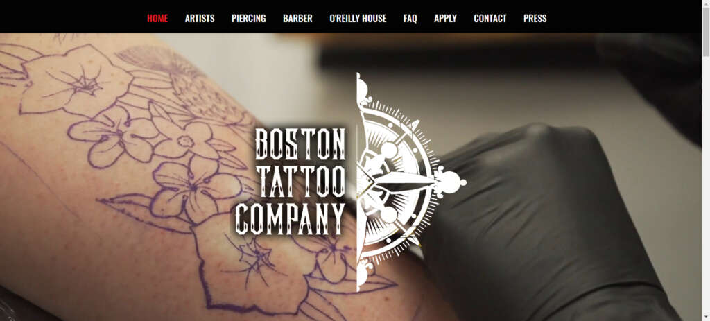
The Boston Tattoo Company’s lasting influence in the Boston region serves as a testament to their unwavering dedication to their art. Their enduring commitment to their craft is reflected in their continued presence in the area, showcasing a passion that has stood the test of time.
Furthermore, the Boston Tattoo Company has built a strong reputation for delivering exceptional tattoos and expert piercings, seamlessly blending expertise with artistic flair. By merging years of experience with a keen sense of artistry, they ensure that every client departs with a one-of-a-kind and unforgettable form of self-expression.
Key Features
1. The Boston Tattoo Company’s website exudes a cool vibe with a full-screen video background, bold fonts, and parallax scrolling.
2. Smartly embedding their Instagram feed on the homepage, they spotlight their best tattoos, creating a visually engaging experience with an edgy design.
3. The site dynamically showcases diverse tattoo styles and artists, immersing visitors in the eclectic tattoo subculture.
4. Offering advanced features like artist portfolios and a virtual tattoo simulator, clients can easily transform their visions into permanent art through a user-friendly booking system.
16. Fitness Center – Movement LAB
In Vilnius, Lithuania, Movement LAB is a dynamic fitness studio that flourishes through the effectiveness of small-group training. Specializing in private and semi-private sessions, the studio is guided by expert coaches who lead participants through a variety of diverse exercises.
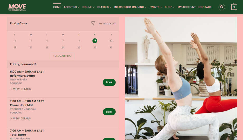
Their website brilliantly captures the energetic essence of the studio, creating a fantastic online environment that radiates vitality and strength. It functions as an enticing platform where fitness enthusiasts can discover personalized training options tailored to their preferences.
Moreover, it nurtures a vibrant virtual community united by a shared passion for holistic well-being and individualized workout experiences.
Key Features
1. Operating on Hostinger web hosting, this user-friendly small business website builder strategically places essential information on its homepage for convenient access.
2. Users can effortlessly find crucial details such as the address, registration process, pricing packages, coaches, and contact information, all neatly displayed on the site.
3. The fitness-themed vibrant color palette complements the website’s dynamic interface, showcasing workout schedules, class details, and comprehensive trainer profiles.
4. Reflecting a modern and athletic aesthetic, the website encapsulates the brand’s holistic approach to fitness. With features like online class bookings, virtual workouts, and a community blog, it emerges as a comprehensive and engaging platform for customers.
17. Clothing Store – La Petite Alice
Headquartered in Lithuania, La Petite Alice specializes in artisanal linen clothing and accessories, employing a personalized made-to-order approach. Their product range encompasses items such as aprons, clothing tailored for men, women, and children, as well as exquisite kitchen and table linens.
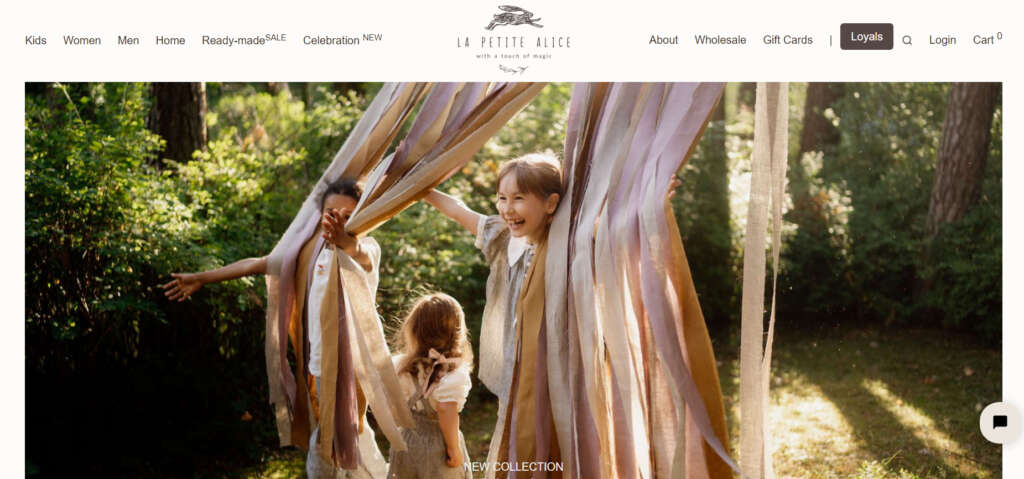
La Petite Alice is dedicated to crafting locally handmade clothing and accessories for the entire family, exclusively utilizing organic fabrics. Operating with an online sales platform, the brand is unwavering in its commitment to ethical practices. By steering clear of synthetics, plastics, and toxic dyes, La Petite Alice stands firm in its dedication to sustainability and environmentally conscious choices.
Key Features
1. The e-commerce platform embraces a soothing palette of beige and brown, mirroring its commitment to slow living and sustainability. The homepage features images and sliders guiding users to various product pages.
2. Soft pastels and striking accents converge in a sophisticated color scheme, creating an elevated atmosphere. The interface’s user-friendliness facilitates seamless navigation through the latest collections.
3. A fashion-forward theme underscores the brand’s unwavering dedication to style and quality.
4. The website incorporates essential e-commerce elements, including a virtual dressing room, quizzes, and a lookbook. These features enhance the shopping experience, particularly for fashion enthusiasts, making it enjoyable and interactive.
18. Pet Goods Shop – Gone to the Dogs
Gone to the Dogs crafts a joyful haven for pet enthusiasts with a welcoming website design featuring lively orange and green hues. Specializing in limited, handmade pet products, they maintain a commitment to ethical practices.
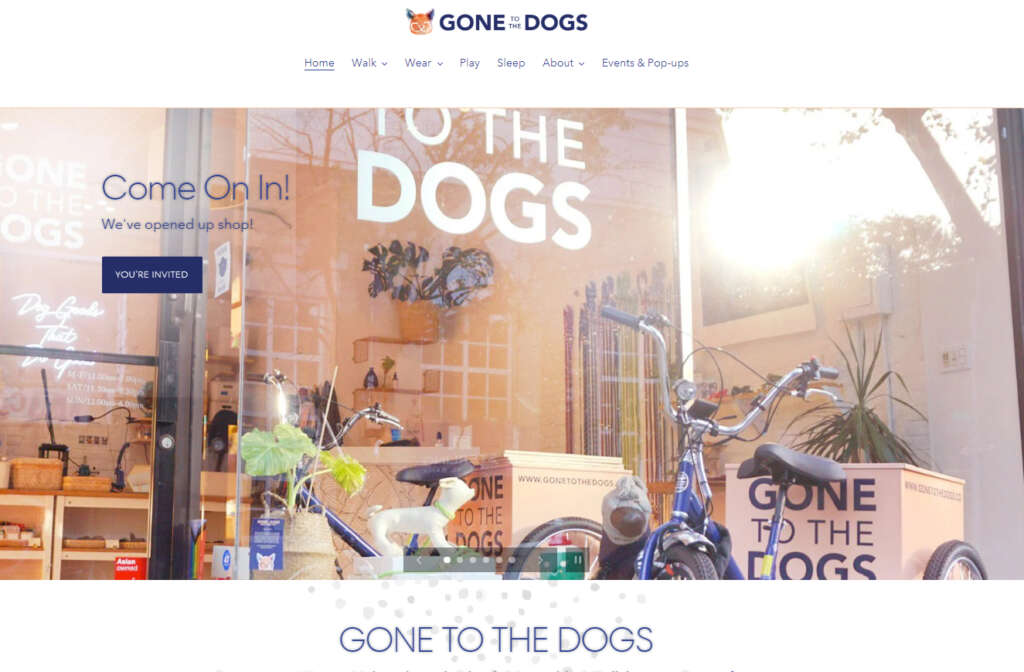
Situated in Brooklyn, this small business guarantees that each item is environmentally friendly, meticulously crafted, and produced with ethical considerations.
Key Features
1. The small business owners present product names, photos, and prices on the homepage for easy browsing.
2. The shop page features practical drop-down menus that filter and sort items by popularity, type, price, alphabetical order, and date, simplifying product searches.
3. Gone to the Dogs’ website distinguishes itself with a pet health blog, personalized product recommendations, and a loyalty program, cultivating a vibrant pet enthusiast community.
4. The intuitive interface facilitates seamless exploration of the diverse pet product range, complemented by a friendly color scheme that aligns with the commitment to limited-run, handcrafted, and eco-friendly goods.
19. Ironwork Shop – Gate Foot Forge
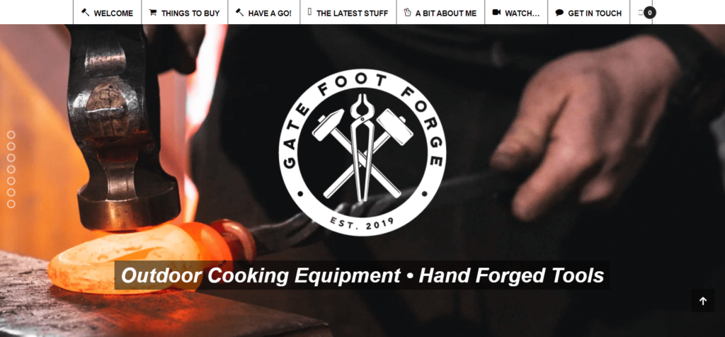
Gate Foot Forge, based in the UK, stands as an accomplished artist, knifemaker, and blacksmith. Beyond tailor-made commissions, the business provides a comprehensive range of iron products and services, including specialized classes in blacksmithing and knifemaking.
Key Features
1. The website boasts bold colors, blending deep blacks and metallic tones for a robust, enduring ambiance. It exudes sophistication, eloquently capturing the intricate details of their custom ironwork.
2. Embracing an artisanal approach, Gate Foot Forge crafts timeless pieces. Visitors can explore past projects, utilize a sleek customization tool, and read client testimonials.
3. A notable feature is the persistent navigation bar that stays visible while scrolling, providing easy access to other pages.
4. A trust-building element includes a picture of Phillips, fostering a connection with the audience.
20. Off-Grid Power Store – Climbingvan
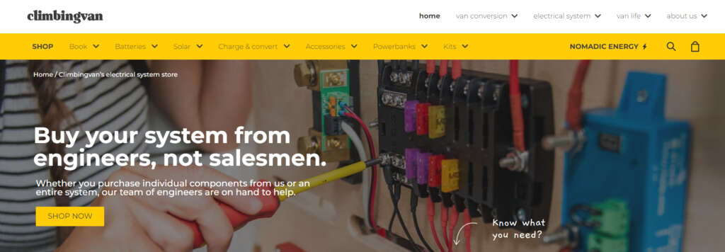
Founded by two dedicated camper van enthusiasts, Climbingvan specializes in off-grid gear. Alongside other small businesses, they provide essentials such as solar panels, batteries, and chargers, enhancing the awesomeness of your camper van adventures. With a shared passion for van life, Climbingvan is your premier destination for all your on-the-road electrical needs.
Key Features
1. The delightful website homepage highlights product sliders with diverse categories, offering HD photos, prices, and real-time stock status.
2. Embracing a color palette that combines earthy tones with charming yellows and blues, the design reflects a strong connection to nature. The user interface is exceptionally intuitive.
3. The website is thoughtfully themed around environmental consciousness, showcasing the brand’s dedication to sustainable energy practices.
4. Noteworthy features include a power calculator, educational resources on off-grid living, and a customer support chat, providing a comprehensive experience for those in search of power solutions.
What are the essential components for creating an effective small business website?
An exceptional small business website functions as a digital storefront, enticing visitors and maintaining their interest. Here are some attributes that contribute to the greatness of a small website.
- Ensure user-friendly design with straightforward layouts, intuitive menus, and prominently displayed contact details for a seamless visitor experience.
- Provide captivating and succinct details about products or services, incorporating transparent pricing, compelling calls to action, and high-quality images to boost visual appeal.
- Guarantee adaptability across various devices (desktops, laptops, tablets, smartphones) with optimized speed, ensuring a uniform and enjoyable user experience.
- Foster trust through the integration of customer testimonials and reviews. Facilitate communication with easy-to-find contact forms and visible social media links for enhanced accessibility.
Conclusion
Establishing a website is crucial for small businesses, providing opportunities for heightened sales, authority, and exposure. Beyond investigating efficient website-building tools, exploring various small business websites offers valuable design insights.
For inspiration, noteworthy examples include Movement LAB for its concise information presentation, Little Karma Co. and Progeny Coffee for compelling story-driven branding, Music Villa for a distinctive video-centric content strategy, and Boston Tattoo Company for its immersive design.
Frequently Asked Questions
Wix is frequently regarded as the optimal choice for small businesses, thanks to its user-friendly drag-and-drop editor and integrated marketing tools. This combination streamlines website creation and enhances online presence for businesses of all sizes.
Absolutely, several website builders offer free plans, making it accessible for small businesses to establish an online presence without incurring upfront costs. Platforms like Wix and Weebly provide essential features to get you started on creating a business website at no initial expense.
Leading website builders, such as Wix, provide an intuitive drag-and-drop editor that simplifies customization, integrated marketing tools for effective promotion, and SEO features to enhance visibility on search engines. These combined attributes contribute to the creation of a robust and impactful online presence.


